Markets Indices
This section enables you to select various market charts over a period of time. You can select the following options:
Global Markets: Compares Asia, Europe, and North American indices over 24 hours. The most current market goes from left to right. Global Markets also shows the last price, % change information (green indicates positive, red is negative), along with a bar chart indicating where the current price is in relation to the 52 week low and high price. In the table, click the name of the index to go the Index page for additional information.
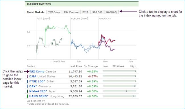
If you mouse over the name of a specific index in the table, the following index chart is displayed:
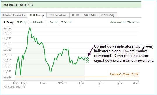
TSX Comp: Charts the TSX Comp index over 1 day, 5 days, 1 month, 1 year, and 5 years. The orange line on the chart indicates the previous day’s close. The line graph above the line is green, below the lie it changes to red. Click Advanced Chart to go to the Index Page for TSX Comp for more information.
TSX Venture:The orange line on the chart indicates the previous day’s close. The line graph above the line is green, below the line it changes to red. Click Advanced Chart to go to the Index Page for TSX Venture for more sophisticated charting.
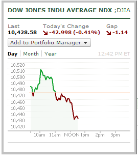
DJIA: The orange line on the chart indicates the previous day’s close. The line graph above the line is green, below the line it changes to red. Click Advanced Chart to go to the Index Page for DJIA for more information.
S&P 500 Charts the S&P 500 over 1 day, 5 days, 1 month, 1 year, and 5 years. The orange line on the chart indicates the previous day’s close. The line graph above the line is green, below the line it changes to red. Click Advanced Chart to go to the Index Page for the S&P 500 for more information.
NASDAQ. Charts the NASDAQ over 1 day, 5 days, 1 month, 1 year, and 5 years. The orange line on the chart indicates the previous day’s close. The line graph above the line is green, below the line it changes to red. Click Advanced Chart to go to the Index Page for NASDAQ for more information.