Risk Return Analysis & Fund Details
This section allows you to chart various aspects of a individual mutual fund’s performance and compare its performance to selected peers within the category.
Highlight box: When you are comparing multiple funds and want to highlight which funds meet specific criteria, such as have a 4+star rating with Mroningstar or are RRSP-eligible funds, the Highlight Box can help do just that. You can highlight the following criteria using this feature:
• None
• TD Funds
• RRSP Eligible
• Morningstar Rating 4+
• Analysts’ Choice Funds
• No Load Funds
Size Represents box: The circles represent an attribute of the fund. By default, the circles show the relative size of the Assets Under Management. You can also have the circle size represent relative Management Expense Ratio (MER), Morningstar Rating, and others.
• Assets Under Management
• MER
• Trailing 1 Year Distribution Yield
• Annual Portfolio Turnover Rate
• Morningstar Rating
• Prev. Change (%)
• 1 Month Change (%)
• YTD Change (%)
Choose from among the different timeframes across the top of the chart and the axes will adjust to show risk and return appropriately.
• 1 year
• 3 year
• 5 year
• 10 year
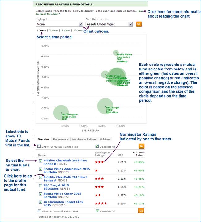
If you hover over a fund name, a screen similar to the following is displayed:
Below the chart is a table with the following tabs.
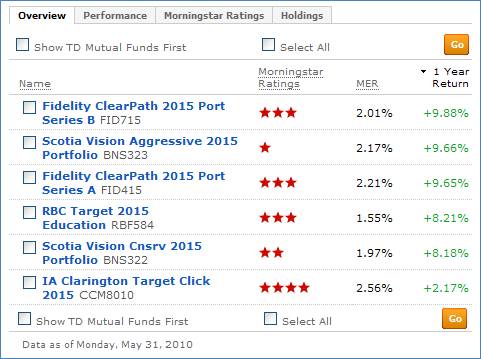
Overview: Provides general information about the mutual funds in the selected category. Click the check box to see the funds in the chart.
• Mutual Fund Name
• Morningstar Ratings
• MER (indicated by percentage value)
• 1 Year Return
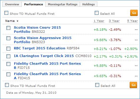
Performance: Provides performance data for 1 year, 3 year, and 5 years.
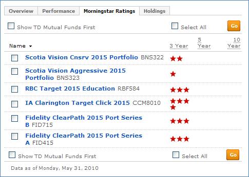
Morningstar Ratings: Provides 3 year, 5 year, and 10 year ratings
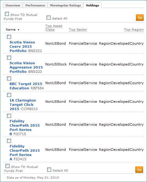
Holdings: Provides information on the holdings of the listed mutual funds including:
• Top Asset Class
• Top Sector
• Top Region